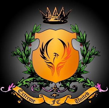
Credits to Wooi Quan (designer) and Benjamin Poh (colouring fella).
Teng Teng Teng.... Wat u all think? But the logo show that we are like heading for a civil war like that because
1st: Got shield. The phoenix represents like a symbol of "Demi negara saya berkorban" or "Saya berkorban demi negara". Ya right.
2nd: Grass. Yeah, got symbol abit like a football field la. But also symbolise something like a war field. U watch Lord of The Rings, the war is wared at the field one. Eh! got pink grass ^^(GAY).
3rd: Got crown. Like Aragon. Is like Maverick asking u in a tone of voice that is like his gonna swallow u like Butcher eat SpongeBob
4th: The background is like black. Dont u realize that everytime war time, the sky turns dark. Is like shit its gonna happen any shit time. But this one got shadow. Waaa. Different wei. Dam cool wei.
Overall its awesome la in my opinion. What u guys think?
.jpg)
No comments:
Post a Comment